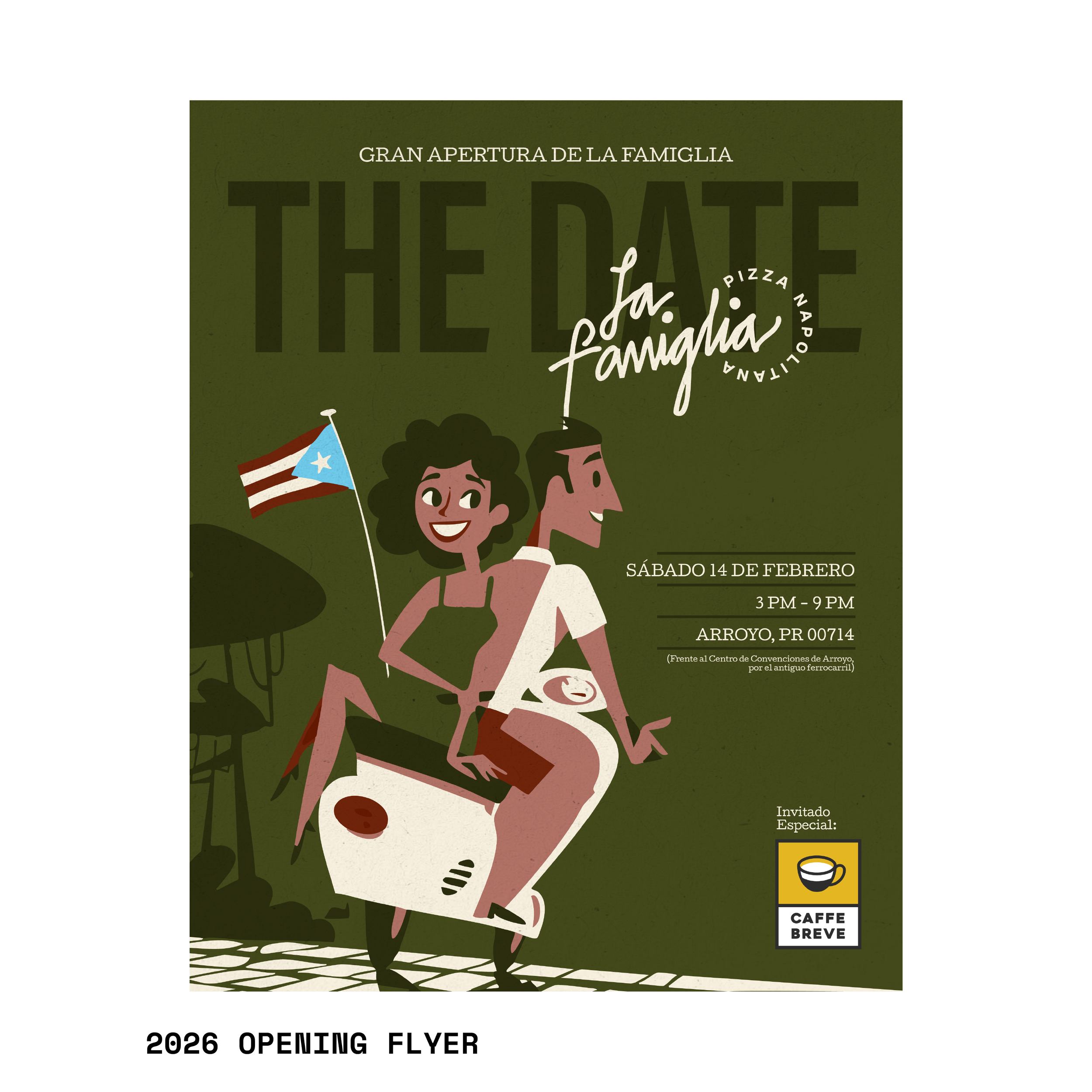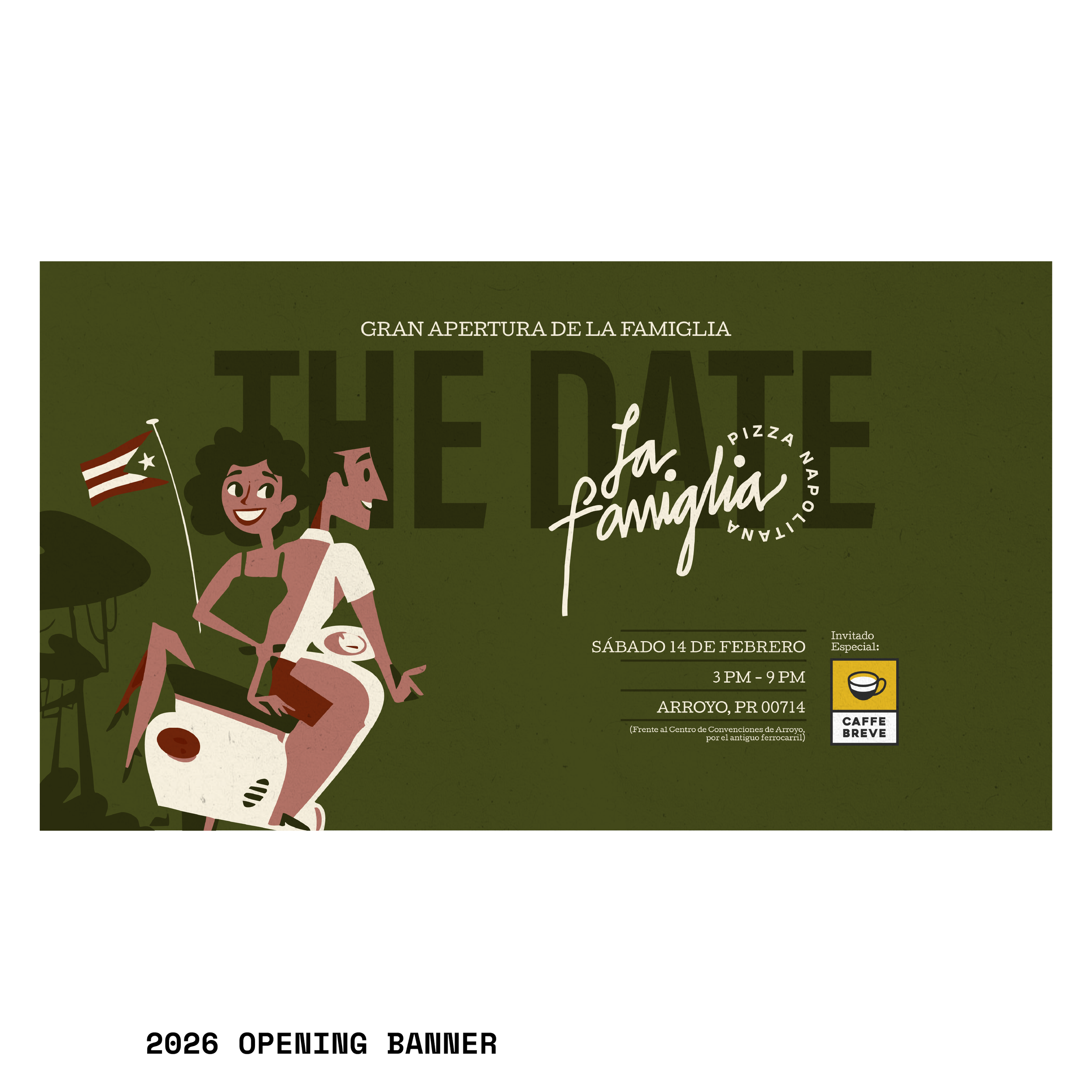
La famiglia
2025
Tags: Logo, Visual identity, Direction, Consulting
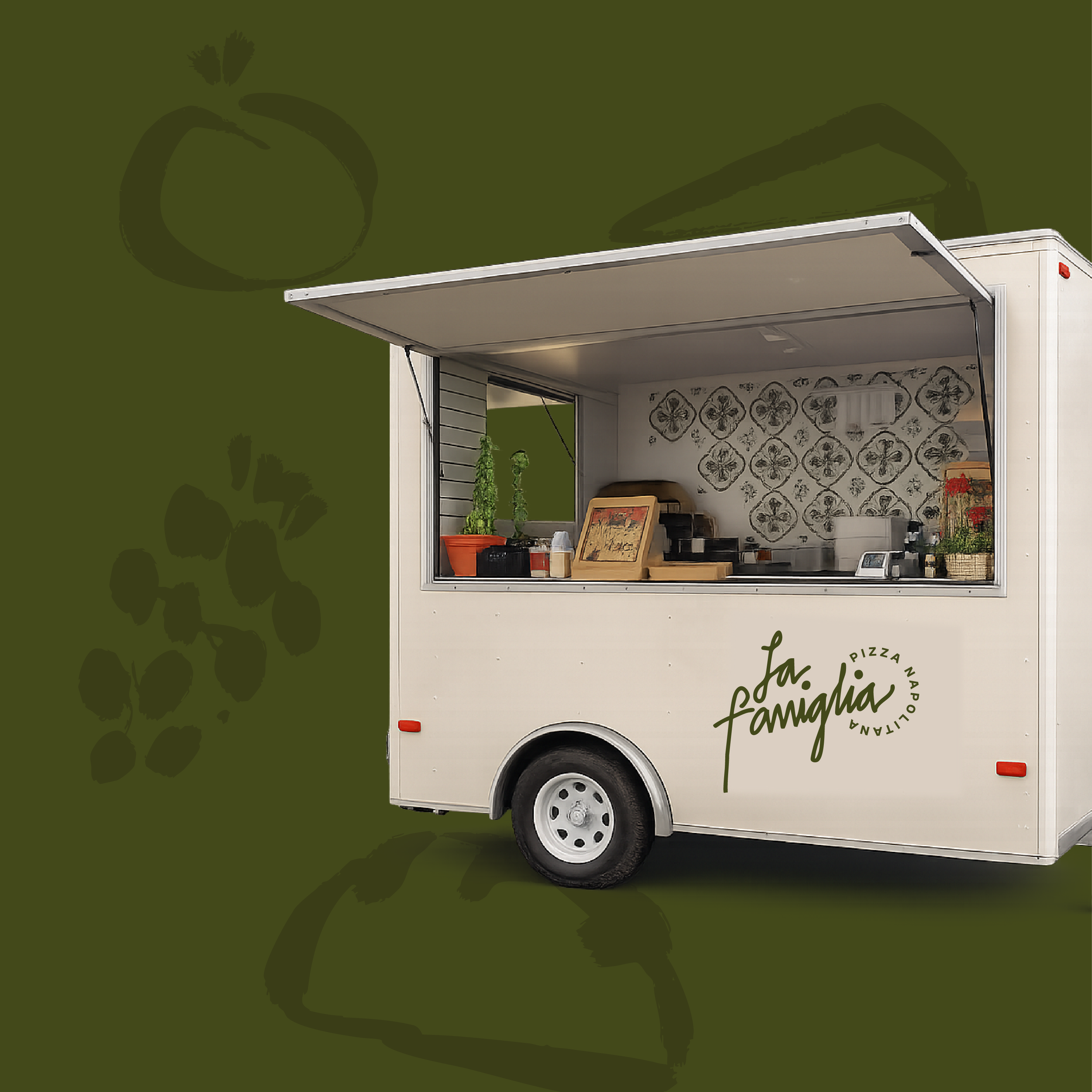
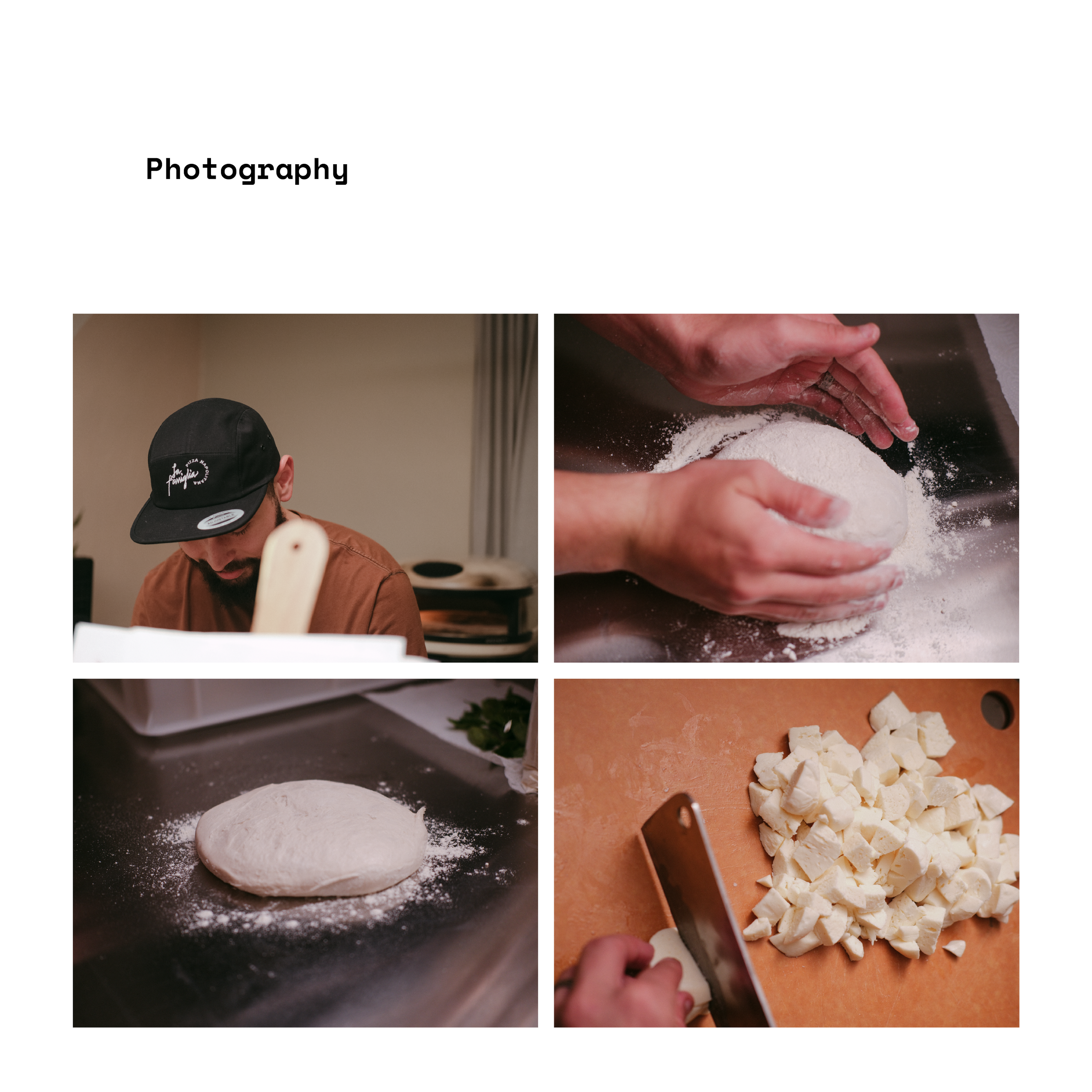
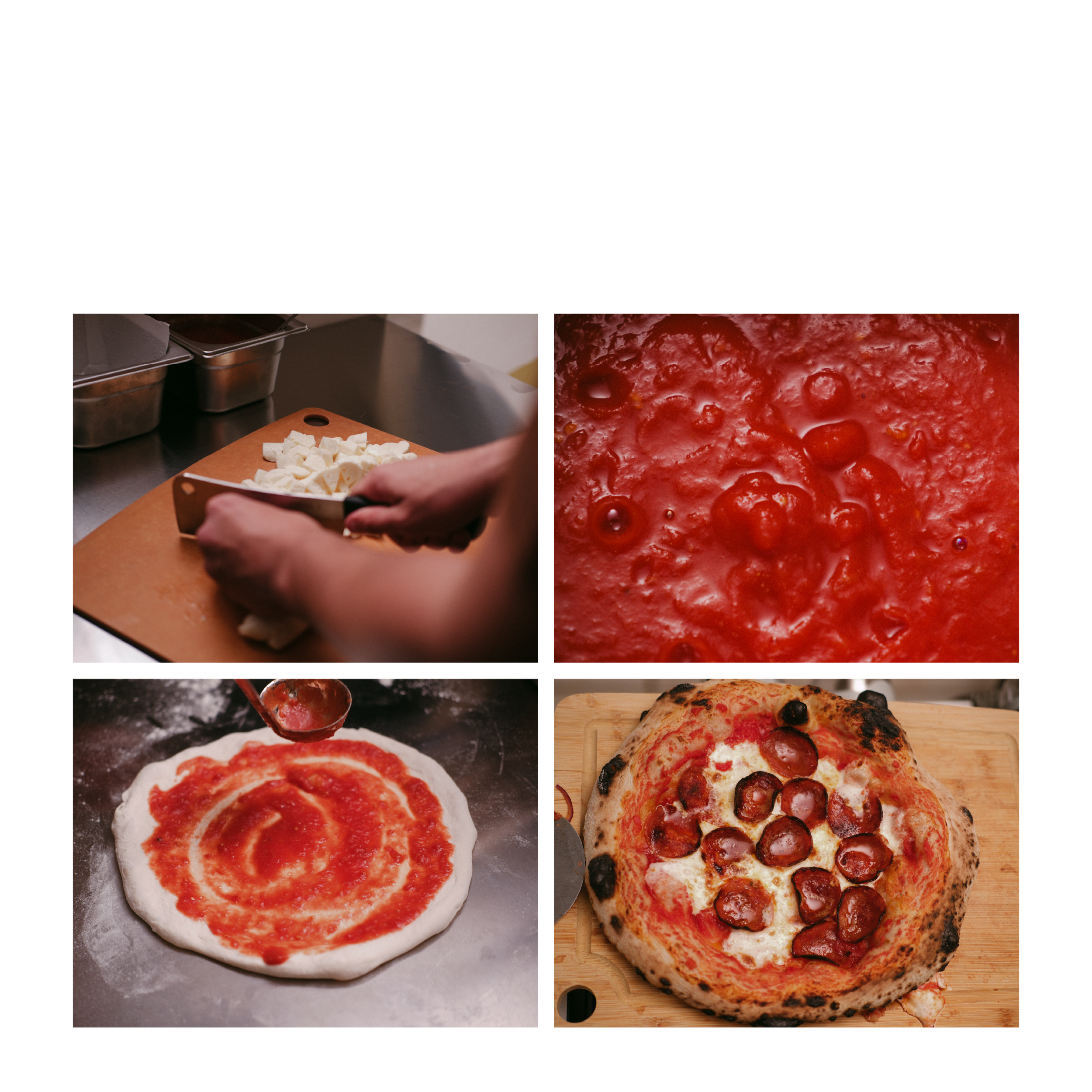
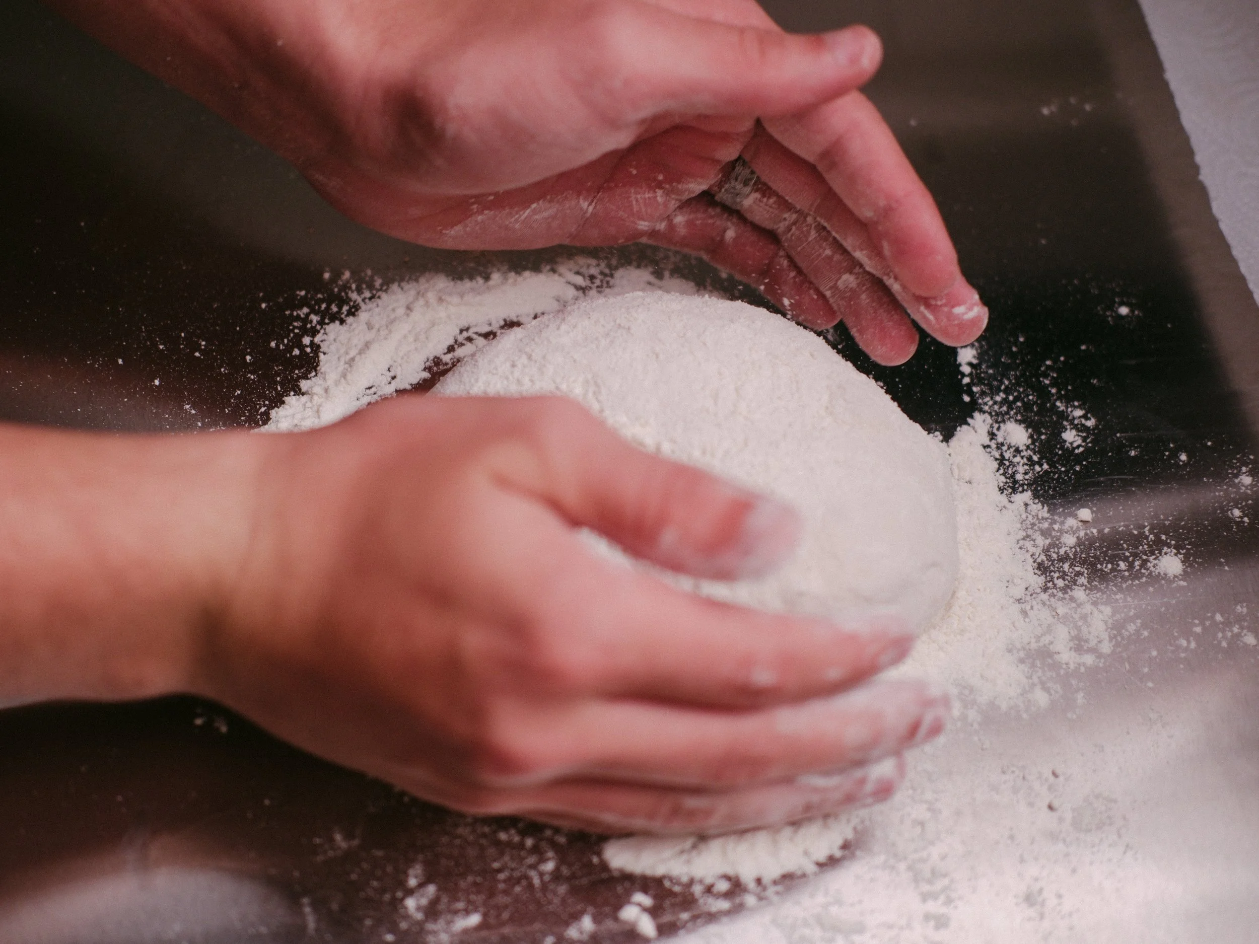
La Famiglia is a Neapolitan pizza food truck and pop-up concept based in Puerto Rico, recently established in Arroyo. Their proposal is rooted in authenticity: fresh ingredients, dough developed from scratch, and a fully handcrafted process that honors Italian tradition.

The challenge was clear:
How do we translate Italian essence, organic value, nostalgia, memory, and family into a simple yet emotionally powerful visual identity?
Concept
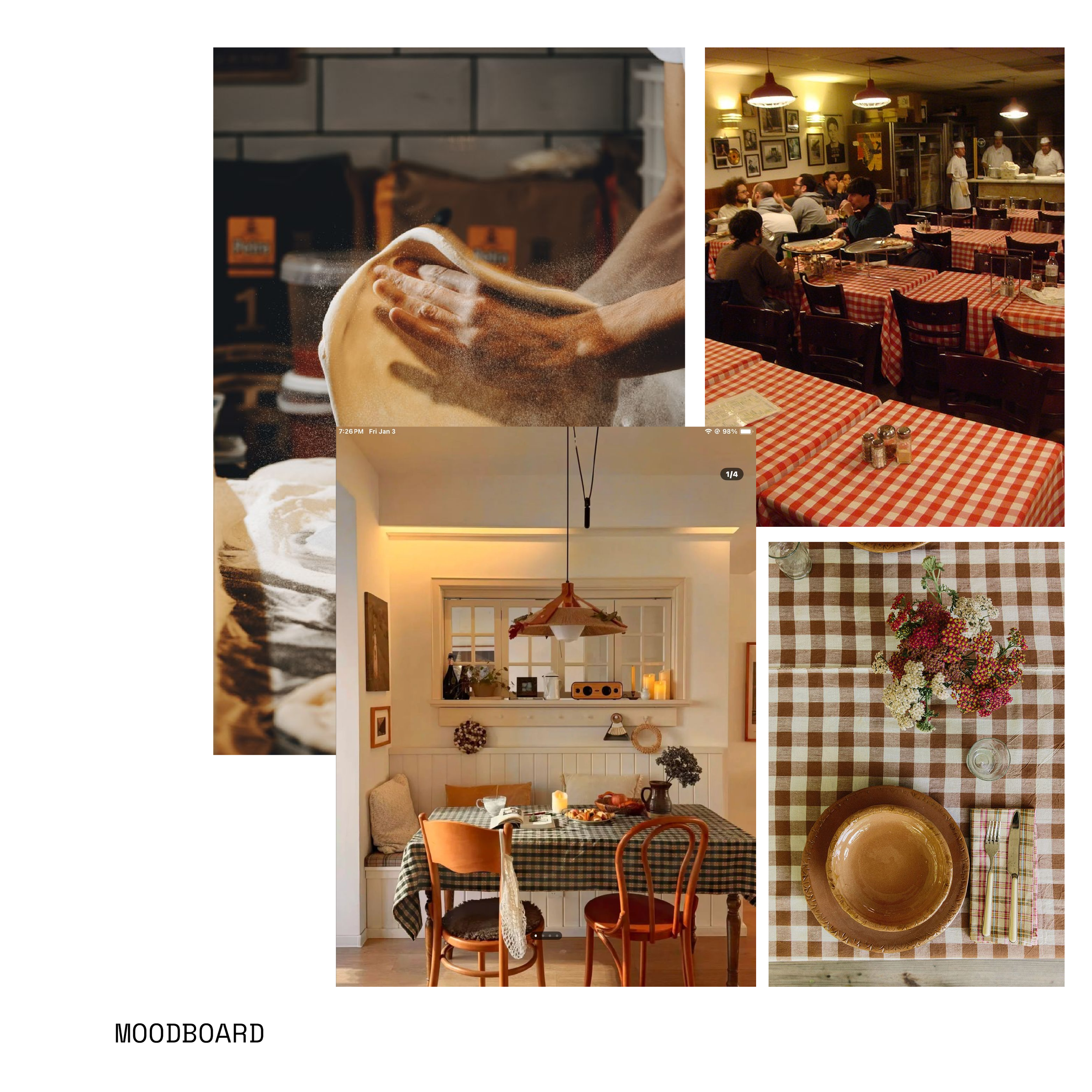
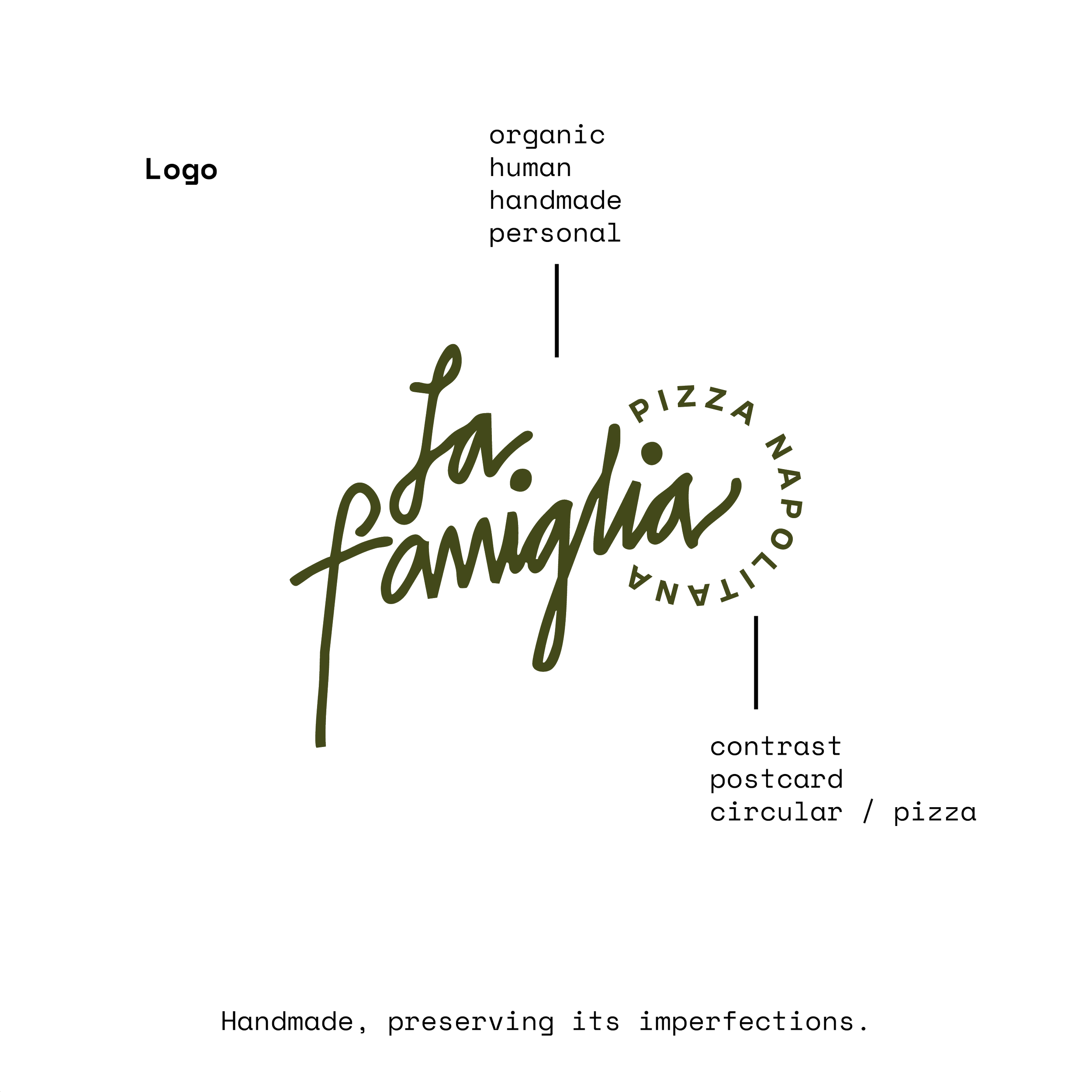
The identity is built around memory.
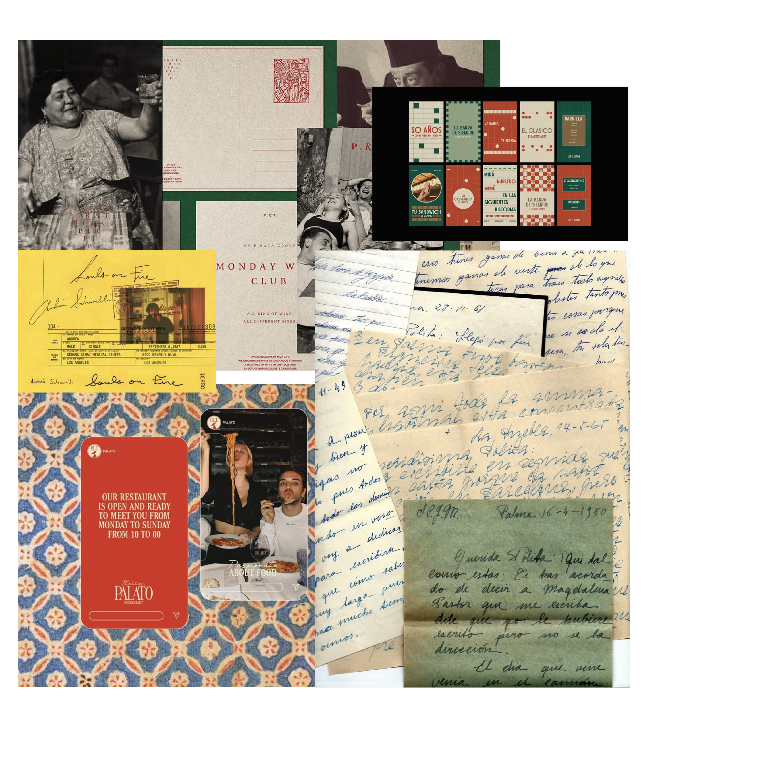
We drew inspiration from 90s and early 2000s postcards — handwritten messages that traveled across oceans carrying personal stories. We wanted the brand to feel like a letter sent from Italy: intimate, warm, and honest.
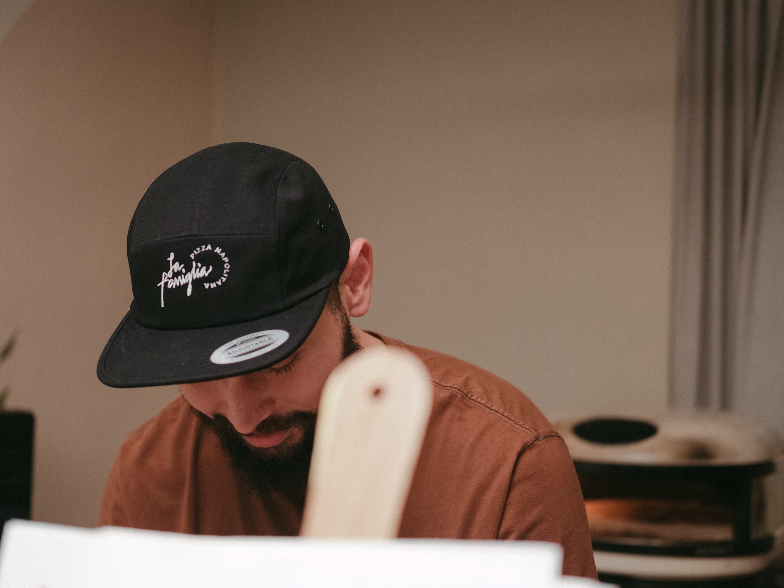
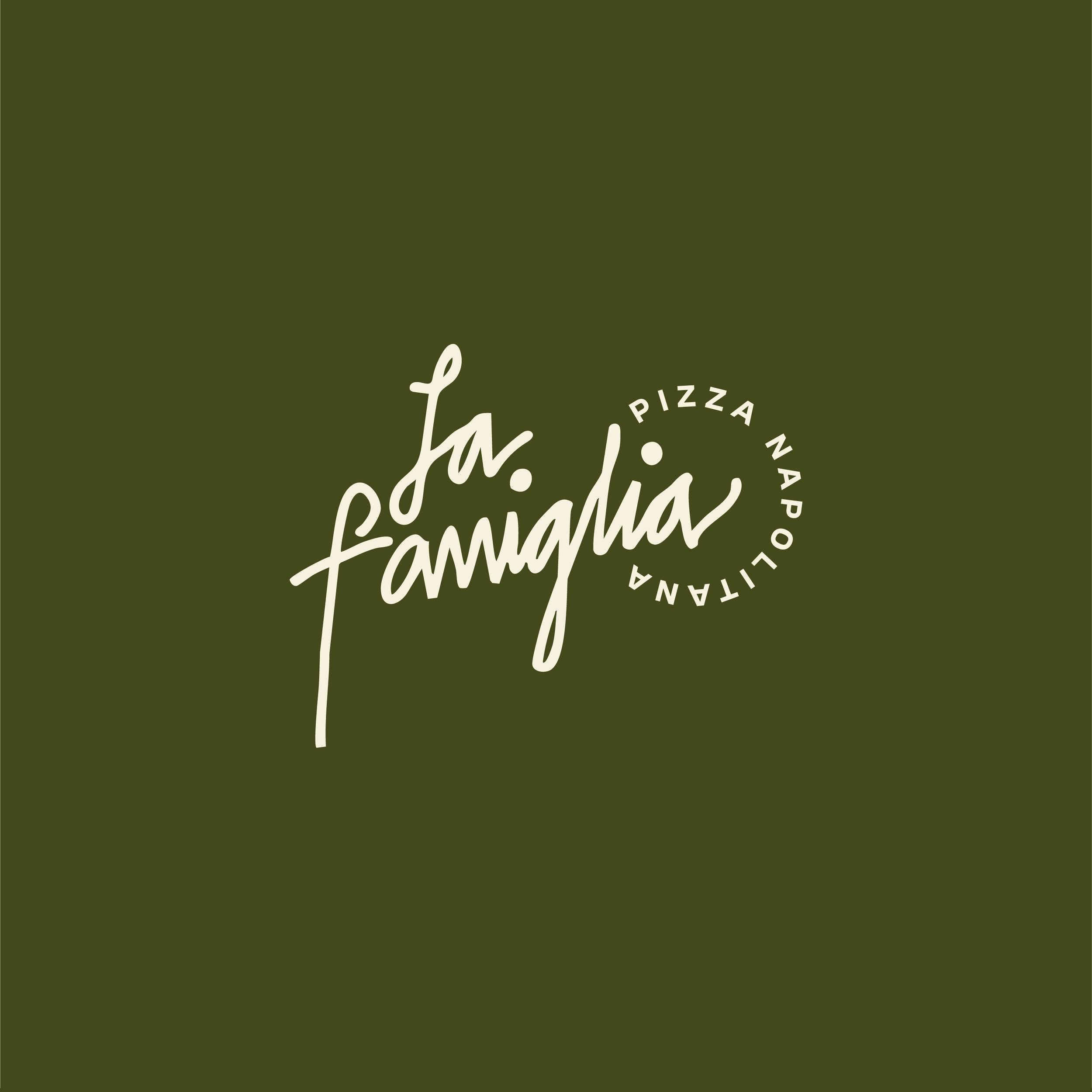
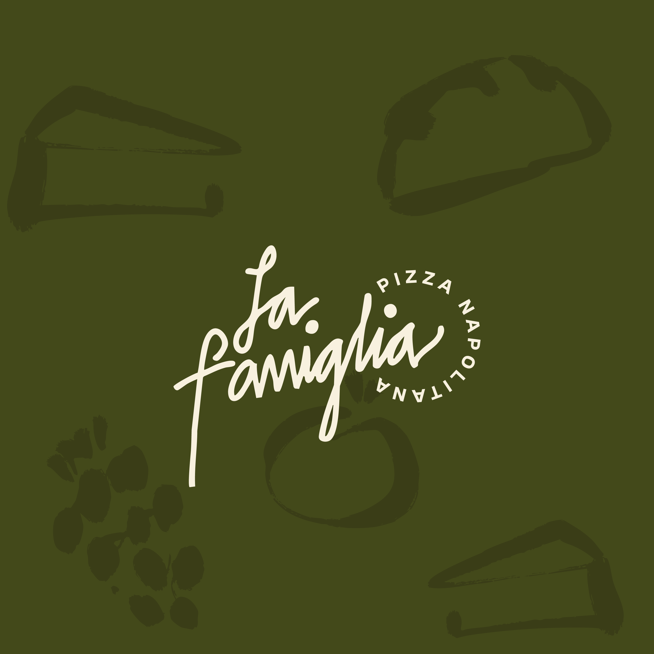
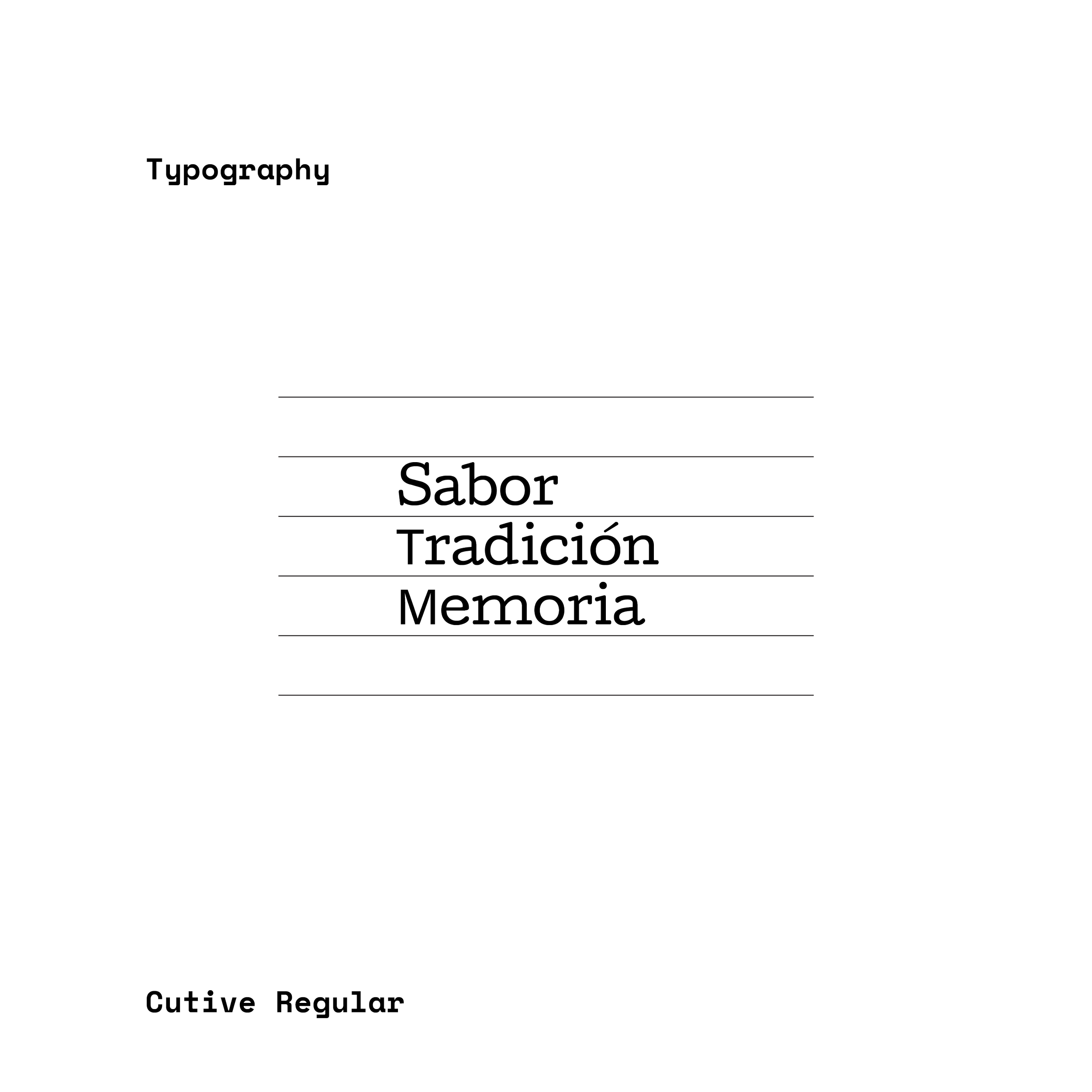
The logo was designed in a handwritten cursive style to evoke familiarity and emotional closeness. It doesn’t feel corporate; it feels human. Like a signature. Like the closing line of a personal letter.
Visual Direction
The brand revolves around three core pillars:
Nostalgia — visual memory inspired by traditional correspondence.
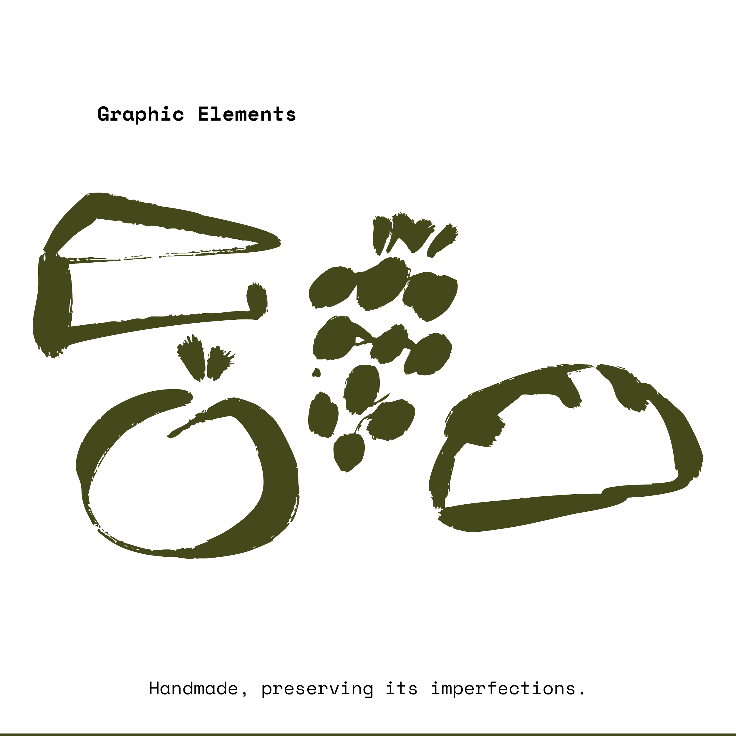
Organic — simplicity, authenticity, and handcrafted value.
Family — intimacy, warmth, and community.
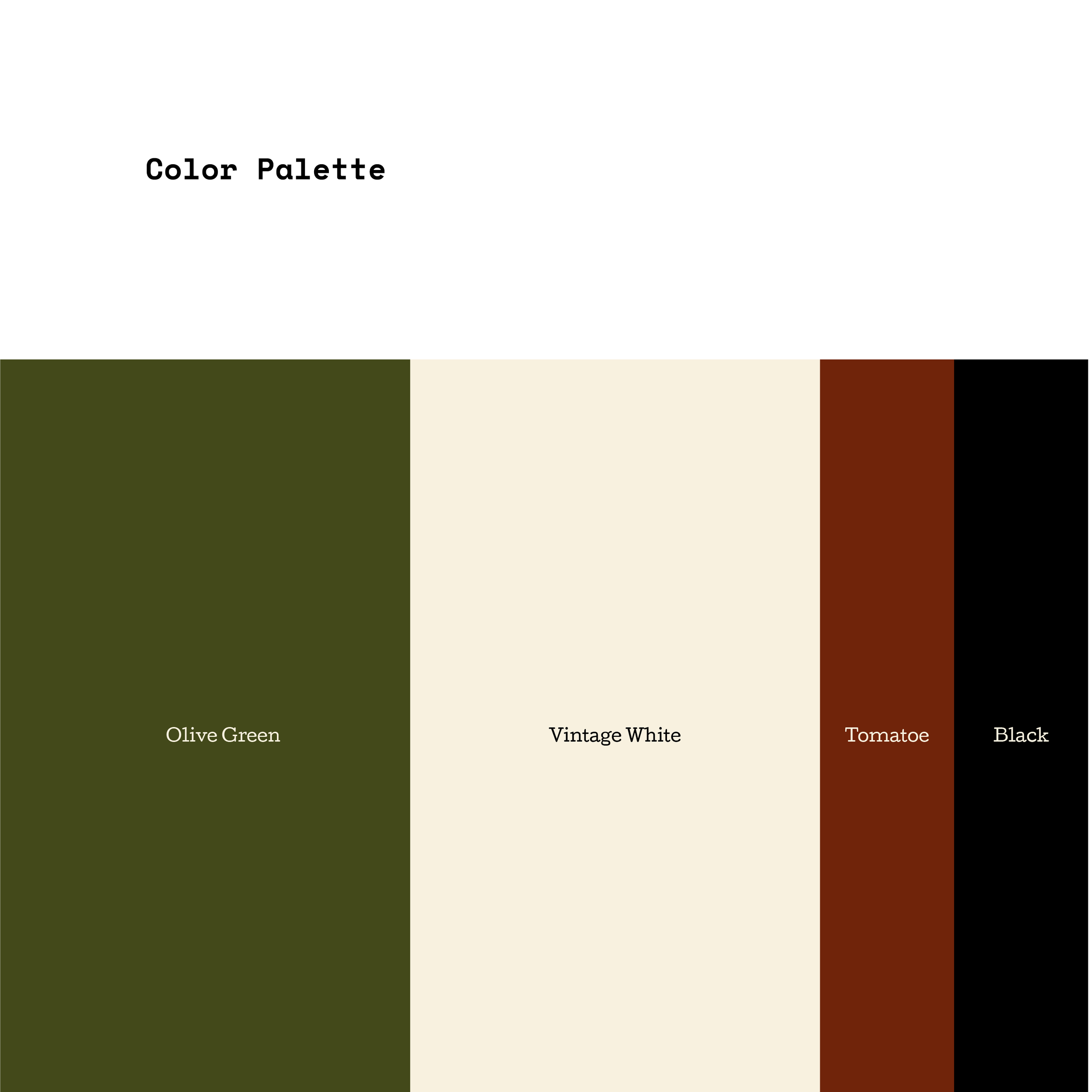
The graphic system translates these values into a clean and minimal identity where the signature mark becomes the emotional anchor of the brand. The design does not compete with the product — it elevates it.
La Famiglia is more than Neapolitan pizza.
It is an experience built on memory, craftsmanship, and family.